
Color theory sits at the pillars of art, psychology, and science, shaping the way we interpret the world and the way creators communicate meaning. A well‑designed palette can make a brand unforgettable or a room feel instantly calming. Even if you’ve never formally studied it, color theory influences your daily decisions—from the clothes you choose to the products you buy. Let’s explore how this fascinating framework works and why it matters so much.
What Color Theory Actually Is
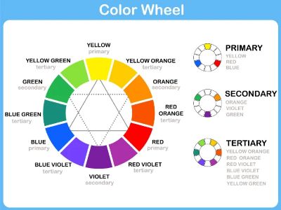
At its core, color theory is a system for understanding how colors interact, how they’re organized, and how they influence perception. It’s built on the color wheel, a circular diagram that maps the relationships between hues. The modern wheel is based on three primary colors: red, blue, and yellow, which combine to form secondary colors (green, orange, and purple) and then tertiary colors (such as blue-green or red-violet). This structure helps artists and designers predict how colors behave when mixed or paired.
Color Harmony: Why Some Palettes Just Work
Color harmony refers to combinations that feel balanced and pleasing. Our brains crave order, and harmonious palettes satisfy that craving. Several classic harmony models help creators build cohesive color schemes:
- Complementary colors sit opposite each other on the wheel, like blue and orange. They create high contrast and energy.
- Analogous colors sit side by side, like yellow, yellow‑green, and green. They feel natural and serene.
- Triadic schemes use three evenly spaced colors, such as red, blue, and yellow, offering vibrancy without chaos.
- Monochromatic palettes utilize variations of a single hue, creating subtle and elegant depth.
These frameworks aren’t rules: they’re starting points. Once you understand them, you can bend or break them intentionally.
The Psychology of Color
Color doesn’t just appeal to the eye; it speaks to the mind. Different hues evoke different emotional responses, though these associations can vary across cultures and contexts.
- Red often signals passion, urgency, or danger.
- Blue conveys trust, calm, and stability.
- Yellow suggests optimism and energy.
- Green evokes nature, growth, and balance.
- Purple hints at luxury or creativity.
- Black communicates sophistication or mystery.
- White symbolizes purity or simplicity.
Brands use these associations strategically. Understanding these psychological cues helps creators craft experiences that resonate on a deeper level.
Color Value, Saturation, and Temperature
Color isn’t just about hue. Three additional properties shape how we perceive it:
- Value refers to lightness or darkness. High‑value colors feel airy; low‑value colors feel heavy or dramatic.
- Saturation measures intensity. Highly saturated colors feel bold; desaturated ones feel muted or sophisticated.
- Temperature and Hue divides colors into warm (reds, oranges, yellows) and cool (blues, greens, purples). Warm colors advance visually, while cool colors recede, influencing depth and focus.
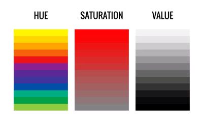
These elements help artists create contrast, mood, and emphasis. A designer might use a pop of saturated color to draw attention to a call‑to‑action button, while a painter might use temperature shifts to create atmospheric perspective.
Why Color Theory Matters
Color theory isn’t about memorizing charts—it’s about intentionality. When you understand how color works, you gain control over the emotional and visual impact of your creations. You can guide the viewer’s eye, reinforce a message, or transform a space. Even small decisions—like choosing the right shade of blue for a website header—can dramatically change how people feel and behave.
If you’re exploring creative work, color theory becomes a powerful ally. And if you’re simply curious about why certain visuals appeal to you, it offers a lens for understanding your own preferences. With this information in mind, it’s important to implement it in any web work that you plan on doing, such as using contrasting colors at the right time.